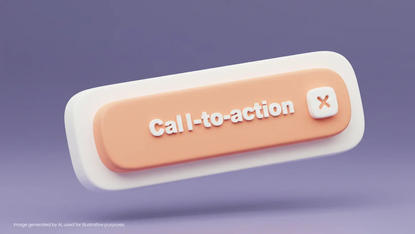
Why Do Some CTAs Work While Others Fail?
We have all seen it. Too many ads that say “Click here to learn more” are one of the examples of bland CTAs that people (and even we ourselves) see. Unlike a clear CTA, the reason why it is often overlooked is that it does not make itself look like a priority.
There is also no strong reason why we need to click it. In this age where attention spans are shorter than ever, a vague or weak CTA means lost opportunities.
Fact: Personalized CTAs outperform generic ones by 202%, as per a HubSpot study. But personalization alone won’t do. It has to be clear, compelling, and action-oriented.
1. Clarity Wins: Just Say Exactly What You Want
The majority of brands overcomplicate CTAs, believing that creativity will make them stand out. But clarity will always defeat the unnecessary jargon.
For instance,
Wrong CTA: Explore More
Right CTA: Get Your Free Ebook Now!
People out there need to know what they’re getting and why it matters. If they don’t know, they’ll swipe on by.
2. Urgency & FOMO: Make Them Take Action Now
A CTA that doesn’t create a sense of urgency is a recommendation. Humans procrastinate—your role is to prompt them to do something now.
- Add time-constrained language (Offer Ends Tonight, Spaces Left)
- Use social proof (Join 5,000+ Marketers)
- Use scarcity (Only 3 Seats Left!)
Example: Booking.com maximizes conversions through dynamic urgency (“Only 2 rooms left at this price!”). It works because humans hate to miss out.
3. Make It Action-Oriented
Your call-to-action needs to instruct users on what they need to do next. Shun passive phrasing—instead, use active action verbs.
Learn More
Download Your Free Guide
Frame CTAs as instructions rather than invitations.
4. Match Your CTA With the User’s Mindset
If you need someone to click that CTA button, make sure to align them in their buying journey. This can be done by creating messages following their intent and readiness to act.
The three stages are the awareness stage (soft sell), the consideration stage (educate), and finally, the decision stage (direct action).
Here is how to know which stage that they are in:
#1 Awareness Stage (Curious but Not Ready to Buy)
- Visiting blog posts, educational content, or FAQs
- Downloading industry reports or guides
- Engaging with social media but not exploring products
To target them, use informational CTAs like “Learn How [Product] Can Help” or “Discover Industry Trends.”
#2 Consideration Stage (Exploring Options, Comparing Solutions)

- Visiting product pages, pricing, or comparison pages
- Watching demos, attending webinars, or signing up for email lists
- Repeated site visits without purchasing
To target them, use value-driven CTAs like “See How We Compare” or “Watch a Demo.”
#3 Decision Stage (Ready to Buy, Needs a Push)

- Adding items to cart or requesting quotes
- Clicking on CTAs but not completing the purchase
- Responding to retargeting ads or emails
To target them, use conversion-focused CTAs like “Get Started Now” or “Claim Your Limited-Time Offer.”
Another tip: Track website analytics, email engagement, and ad interactions to pinpoint where they are in the funnel.
5. Test, Test, and Test Again
No CTA is a one-size-fits-all. A/B testing can uncover what works best.
What can you do? You could:
- Alter CTA wording (Get Started vs. Try It Free), test button color (red vs. blue can be a game-changer!)
- Adjust placement (above fold vs. bottom of page)
Remember, small changes matter and it can even increase the CTR rate by a lot. Always test.
Closing Thoughts: The Strength of a Simple CTA
A great offer is useless if people don’t click. A clear CTA removes hesitation, guides users, and gets real results. If you’re still using “Click Here,” it’s time to rethink your strategy.
Try this: Revisit your current CTAs. Are they clear? Urgent? Actionable? Test a new version and see the difference for yourself.
Want to have a CTA that really works?
Click here to book our ad services! Be it TikTok, LinkedIn, or Google ads, just name it.